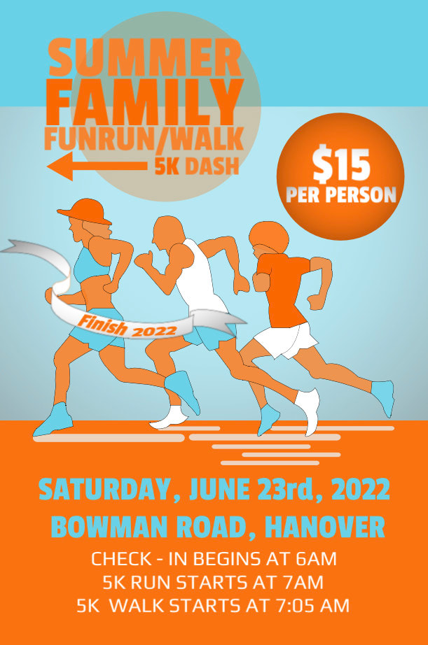
Objective: We were tasked to create an event poster including main graphic and letters with only two colors, and two different type style of letters.
Direction: First, I traced the people running from the picture I got from the internet using pen tool. Next, I created a rectangle shape to represent the ground and another rectangle to represent the sky. Then I add rectangles with cut on the corner to represent their shadow. Next, I trace a finish line ribbon I got from the internet using pen tool. Next, I used two color that has RGB number of 250, 105, 0 and 105, 210, 231. I was able to change some of the color because I lower the capacity of the two colors and used the color drop to make it easier. Next, I used two letter type style called Passion One and Play. I have to separate some of the letters so I can put them together in organize form, and I add an arrow to represent where the family where running to create a stylish look. Lastly, I created a circle, lowering the opacity to filled the space and make it more exciting. Then, the effect that I only used was vignette.
Likes: What I like about this project is the shadow and the people running because although they are not real people, it made it looks realistic with shadow and a finish line ribbon which I thought was a great idea to put it.
Dislikes: What I don't like about my project is the back ground, I would do this again maybe put a city or trees in the background so it does not look so simple.
