Superhero Cartoon
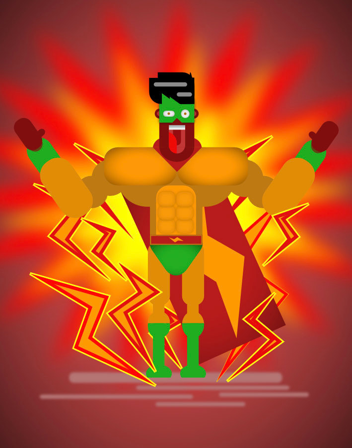
Objective: We were tasked to create our own superhero character as cartoon. I superpower is being able to stop the time just like Flash he can run faster and slow the time because of his speed, but I want to slow the time because as I grow up I feel like time goes by really quick and I want to spend more time to the people I love longer and help civilians who need help.
Direction: First, I used a lot of rectangles shape and round the corners to create the face, body, hands and feet. I also used the knife tool just like what I did to the cape close the face and his sock. Next, I used pen tool to create an electric energy because I feel like I am similar to flash but I also want to slow the time. Then I used the star and add some points to it and used the blur effect in the background to make it looks like its exploding in the back. Then, I used the vignette effect to make it more realistic add shadow inside. Lastly, I color them making the color a little more dark so it does not looks boring. Lasty, to make a shadow I create another rectangles and round the the corners and use the blur effect.
Likes: What I like about this project is the background I was having a hard time figuring out how to fill the white space in the background and after thinking for a longer time I finally found that connects to my character.
Dislikes: What I don't like about my project is both hands are the same, I could've change the other hand and make it looks like hes holding in his hips flexing his muscle more.
Landscape
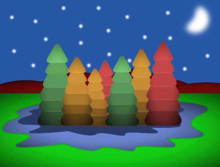
Objective: We were tasked to create a landscape similar in style to the provided video that uses Inkshape using gravit.
Direction: First, I create a triangle shapes and round the corners a little bit and stacking and grouping them together and create another layer. Next I use the same color on a stack triangles but changing into dark but the same color. Next, to create a pond using a pen tool. Then I create a rectangle for the ground as color grass. then a mountain using pentool vignette.
Likes: What I like about this project is
Dislikes: What I don't like about my project is
Logo
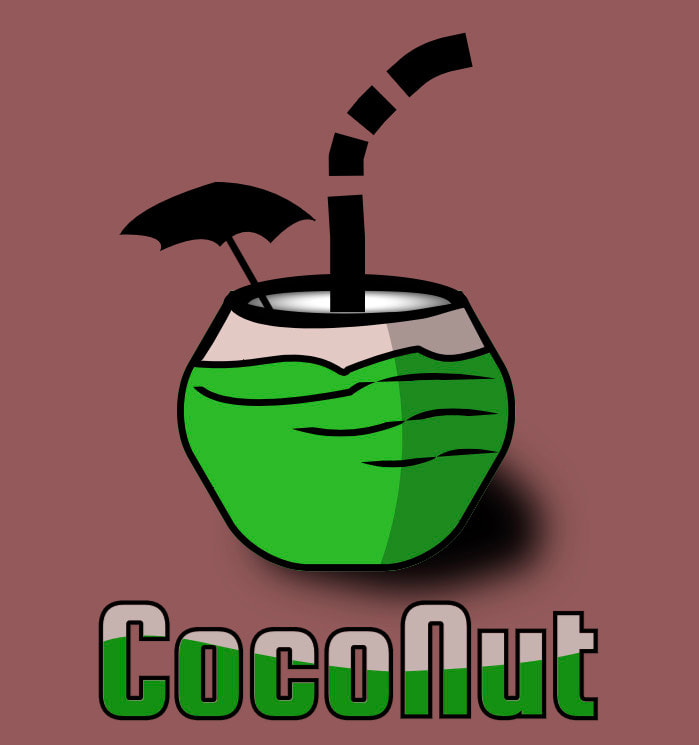
Objective: We were tasked to create a vector version of the logo demonstrated similar in style to the provided video that uses Inkshape on Gravit.
Direction: First, I create the straw, making the line thick and using knife tool to split it. Next, I create a polygon and round all of the sides to make it looks like coconut and makes the out line thick a little. Next, I using pen tool I created the top of the coconut and the small umbrella with a line. Next, I create a circle for the coconut inside and used the blur effect to make it looks real coconut. Then, using pen tool I able to make a line on the coconut. Then, to add the shadow on the coconut I used a pen tool tracing the outline on the right and lower down the opacity with color black. Next, I used the Squada One text letter to write the coconut. Then, used the pen tool create a beautiful two color wave in the middle of the text. Then, I used the create a clip tool to separate them into two color. vignette. Lastly, I created a shadow by duplicating the coconut and turn it into black and change some size at the bottom and add the blur effect.
Likes: What I like about this project is the inside of the coconut looks surreal and the shadow of the coconut makes it more looks realistic.
Dislikes: What I don't like about my project is the small umbrella were not even it should be looks more even to make it more realistic.
